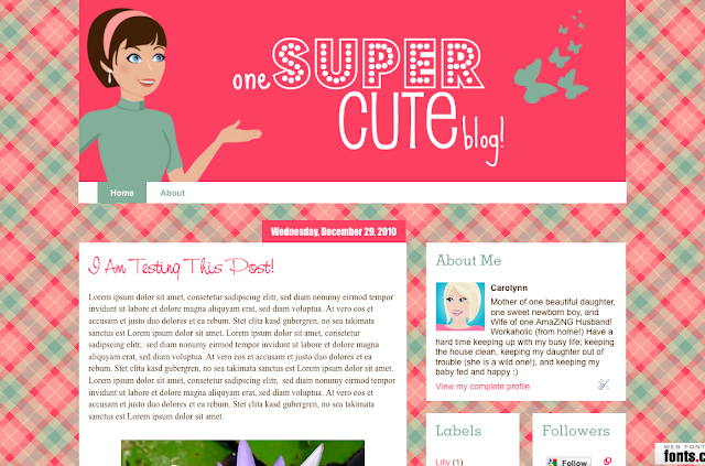
This is brand new, but I think I am going to steer away from Weeks, for the time being anyway, every Monday (or almost every monday), I am going to make a cute blog, and show you how I did it!
This weeks blog is "One Super Cute Blog" Click Here to see it live.
- Free Blogger Blog
- Free Account on Colour Lovers
- Cute Illustration
- Picnik (no registration or sign up required)
- Free Account on Fonts.com Web Fonts
I used the new 2010 Orange Awesome Inc. Template to get started. You can find it under your Template Designer.
I used Colour Lovers (Totally Free Website) to make my background. I have a tutorial here that shows you how to do it :) This is the background that I came up with:
I made my header using Picnik (Totally Free & No Sign up or Registration Required). I used my newest illustration pack for sale over at my Design Shoppe (sorry it is so bare at the moment, but I promise, I will add more soon).
Click Here for a tutorial on how to make headers in Picnik, and below, I have shown what I did differently from the tutorial. When I saved it, I saved it at 900px wide, and I saved it as a PNG instead of a JPEG.
Now I need to make a few adjustments to the to make it look nicer. First thing I am going to do is change the top bar from Blue, to Transparent. If you don't know how to do that, CLICK HERE for a tutorial.
Next I am going to play with the layout of the blog. So I went to the Template Designer, and selected a body and footer layout that I liked.
Now I am going to change the font colors, sizes, etc. They are all under the Advanced section:
I am not excited about how the date looks, so I changed it a little. If you want your Date to look like mine, go back to your Add CSS under Advanced, and add this code:
.main-inner .widget h2.date-header {
background: repeat-x scroll center bottom #FE4365;
border-bottom: 0px solid transparent;
border-top: 0px;
margin: 0 -15px 1px;
padding: 0 0 0px;
}
.main-inner .widget h2.date-header span {
border-left: 0px;
border-right: 0px;
}
background: repeat-x scroll center bottom #FE4365;
border-bottom: 0px solid transparent;
border-top: 0px;
margin: 0 -15px 1px;
padding: 0 0 0px;
}
.main-inner .widget h2.date-header span {
border-left: 0px;
border-right: 0px;
}
If you want the color something different than the pink that I chose, change the #FE4365 to the color value of your choice. You can use ColorPicker.com to find a color. Now your Date should look like this:
I also didn't like the orange border around the Post Body area, and the Gadget area, so if you go to your Advanced, and Post Background and Gadget Background, you can change it there. I changed mine just white.
I love Non-Web Fonts :) I never understood why web fonts were always so boring, so CLICK HERE for a tutorial on how to change your font to something a bit more fun. This is how mine turned out:
If you don't have any pages, CLICK HERE for a tutorial on how to make them, and how they work.
Once you have your pages, the Navigation Bar will look like this:
First off, I don't like how it goes all the way across, and I don't like that it is transparent, and I really don't like the Orange....
So first, I am going to go to my Add CSS section, and add this code:
.tabs-outer {
background: white;
width: 900px;
margin: auto;
}
.tabs-cap-top, .tabs-cap-bottom {
border-top: 0px;
}
background: white;
width: 900px;
margin: auto;
}
.tabs-cap-top, .tabs-cap-bottom {
border-top: 0px;
}
This is how it will look now, if you don't want it white, put a color value in the place of where it says "white". Also, if your header is something other than 900px wide, change 900 to match the width of your header.
Now to fix the buttons, go to Advanced, Tabs Background and Tabs Text to get it to the colors of your choice.
Here is my Final Nav Bar:


0 comments:
Post a Comment